Cluster Maps
Managing Large Data Sets
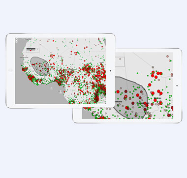
Information-rich maps are a valuable tool for showing important relationships, identifying business trends, and illustrating opportunities. However, plotting thousands or millions of markers on a map can quickly lead to visual overload and impede analysis. When a map has too many points to convey a clear meaning, the information needs to be simplified. Reducing the amount of points on the map can be accomplished by grouping points by certain criteria and displaying with different colors and sizes, icons, placement rules, and more . MapLarge's clustering options offer a variety of choices for interpreting and presenting large data sets.
Organized vs Cluttered
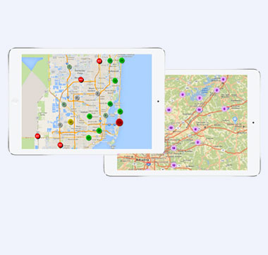
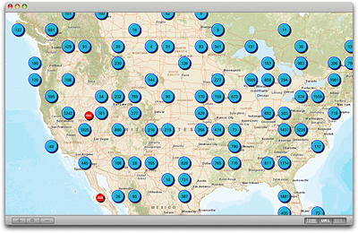
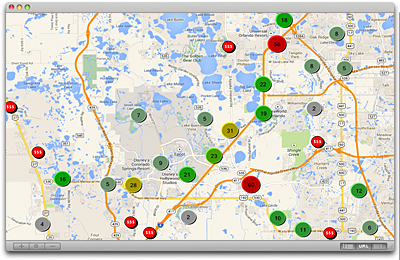
The cluster map below has organized hotels in the Orlando area into numbered groups. It only takes a second to figure out how many hotels are in each location around the city. The point map shows every hotel in the same area. With all the points overlapping it is hard to distinguish exactly how many hotels are in each location without zooming in on the map.
Click on either map for a demo.
Clustering

Hotels locations are easy to find and there is a count in each marker showing how many hotels are around the specified location.
Point Map

With so many dots covering each other, it is difficult to see exactly how many hotels are in a particular location.
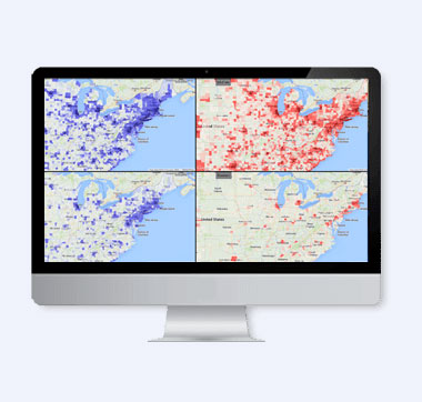
Types of Clustering
Cluster Griddy
The map is divided into squares of a certain size and the cluster marker is placed in the center of each applicable grid square. As zoom levels change so do the clusters and their location on the map but they will maintain their grid like appearance.
Cluster Natural
Clusters have a natural appearance on the map. Location is used to control placement within the clustering grid. The original x,y map location of the cluster's founding data point is used for the location.
Cluster Vary Size
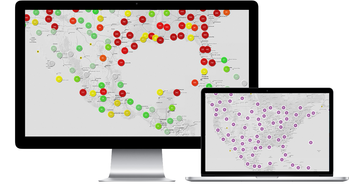
Cluster design can be fun and interesting. Different colors, shapes, and icons are useful for emphasizing clusters on the map. Clusters with a higher number count will stand out if given a larger size or a brighter color. This map of Orlando gives the potential visitor an idea of how many hotels are available in the area and where the more expensive hotels are located.
Cluster External Icons
MapLarge provides a suite of design options for map icons but also offers the option to use external icons. Simply include the url to an external icon and it will appear on the map.
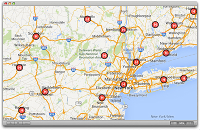
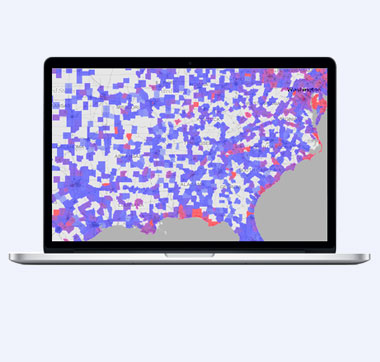
Cluster SnapToTable
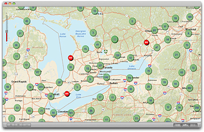
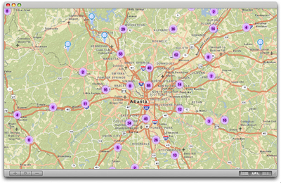
The SnapToTable option will place the cluster point on or near the closest large city in the grid area. This demo shows clusters of hotels around large cities in the Northeast.